Reframing a story through structure and tension.
This experimental book cover redesign explores how visual structure can reflect narrative tension.
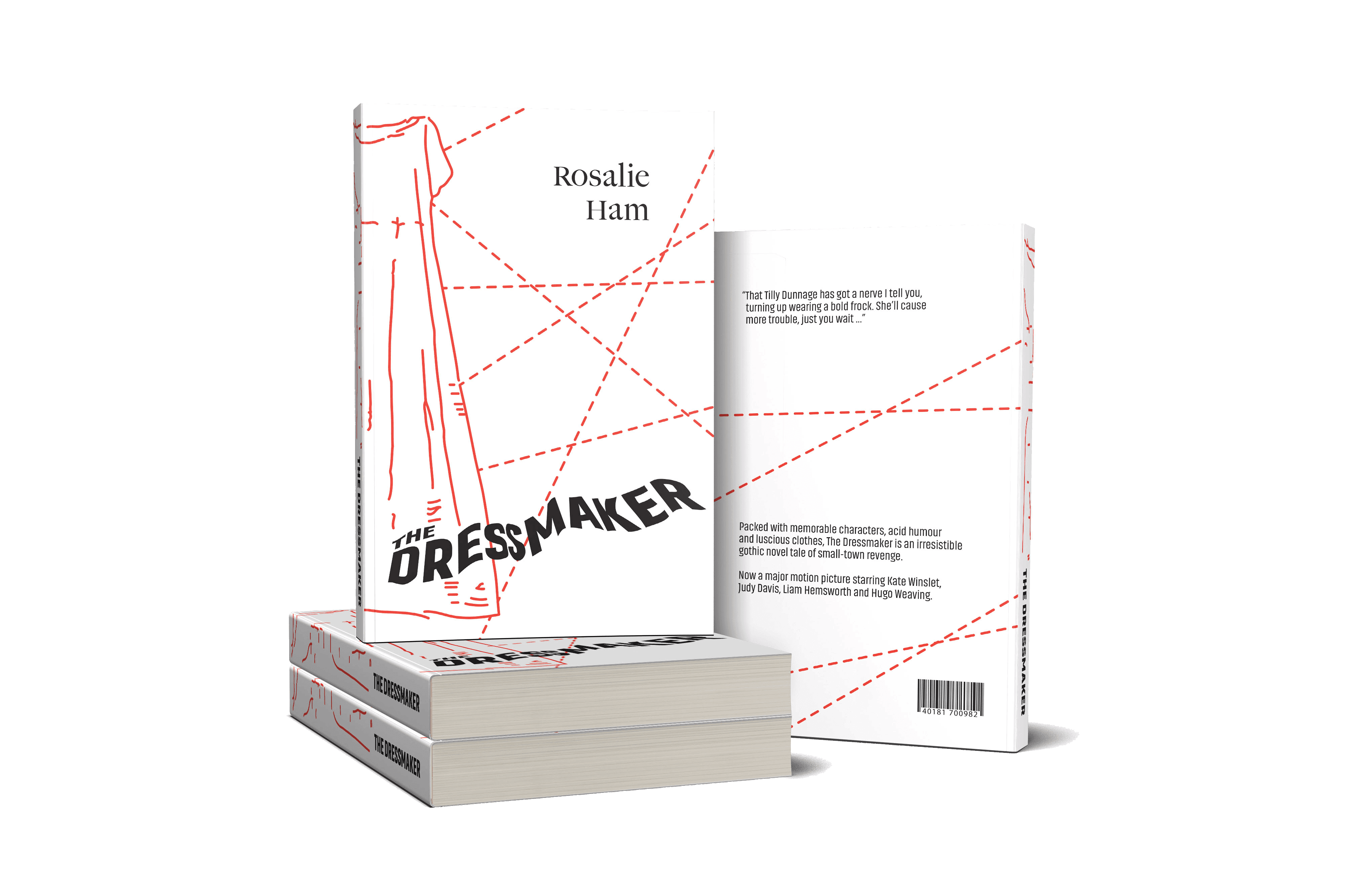
The concept is built around intersecting dashed lines — referencing both tailoring patterns and invisible social connections within the story. These graphic elements create a sense of controlled disruption, framing the title rather than decorating it.
A restrained typographic system and limited color palette reinforce clarity while allowing the linear structure to carry the emotional weight. The result is a cover that communicates conflict and cohesion simultaneously.